A brief introduction to Chuck
Dear Ben
My interest in working with a brand like CAMP can be traced back to when I was a kid building shops in my basement using the souvenirs I brought home from our family trips. Or, trying to open our home for guests to come in and “experience” Easter through the decorations I had set up throughout the living room. My mom wasn’t too happy about that one.
But, I digress. Even before I was a designer, I looked for jobs that were more interesting. More engaging. More disruptive. While earning my BFA in Graphic Design at University of the Arts, I worked at the Franklin Institute of Science and the Philadelphia Art Museum, to name a few.
With a sense of joy and childlike wonder, Chermayeff & Geismar propelled me into the world of Visual identity, experience, and environmental design for corporate and cultural institutions throughout the city and the country.
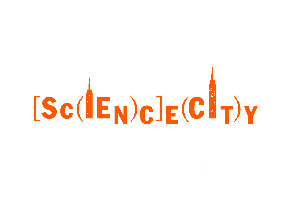
SCIENCE CITY
NEW YORK HALL OF SCIENCE
Logo, signage, and interactive pop-up city exhibits
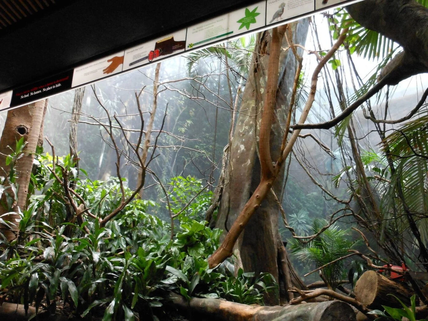
WORLD OF BIRDS
BRONX ZOO
Signage system, mural, and interactive room development
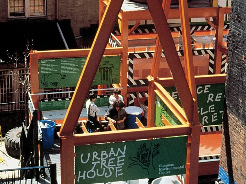
URBAN TREEHOUSE
CHILDREN’S MUSEUM OF MANHATTAN
Signage and art direction for the kids “Reduce, Reuse, Recycle, Rethink” exhibit
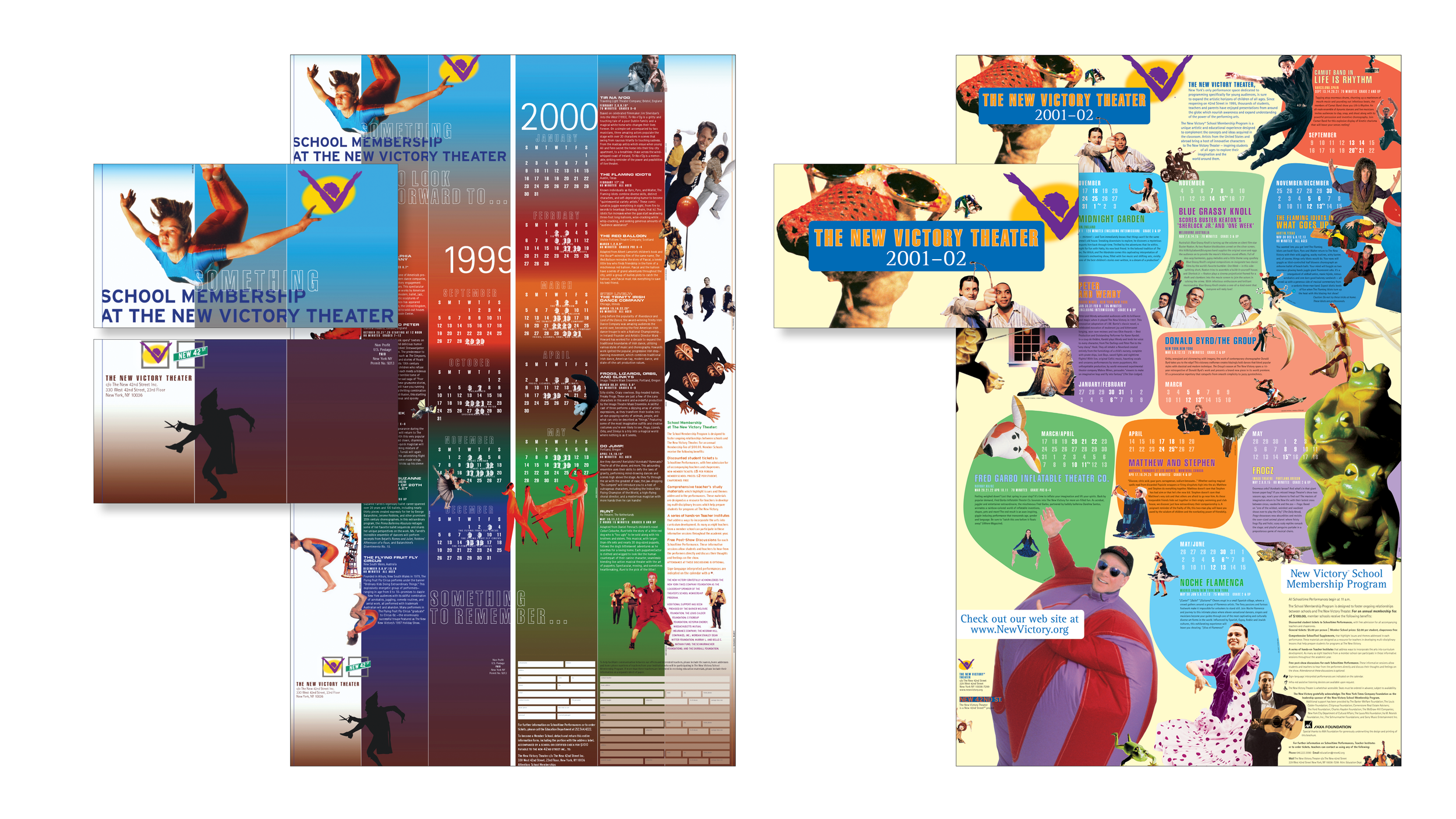
I collaborated with a group of New York performing and visual arts high school students to develop the full brand experience for the first theater on the New 42nd Street for kids and families. Work for The New Victory Theater included visual identity, wayfinding and façade signage for the beginning of what would be a significant change to the neighborhood and the city.
Recruited by the client to come in and build and run the inhouse design group, I spent five years inventing The New Victory experience. Through seasonal marketing, capital campaign and program development, and the wildly successful education groups, we created a brand that talks to and with kids and families while maintaining a sense of integrity and sophistication.


My time at Ogilvy and Brand Union, provided the space to play and experiment while leading and managing global clients through advertising and marketing campaigns, acquisitions, product innovations and launches, and brand refreshes.
It’s here that I learned the concept of, “why not?” Why shouldn’t we refine the logo to more clearly represent the brand? Why can’t DuPont be a respected brand in the retail space? Why can’t we break the Amex card design down and make a new one that’s relevant to teens and parents? And, honed my skills in getting clients equally excited and asking the same questions.
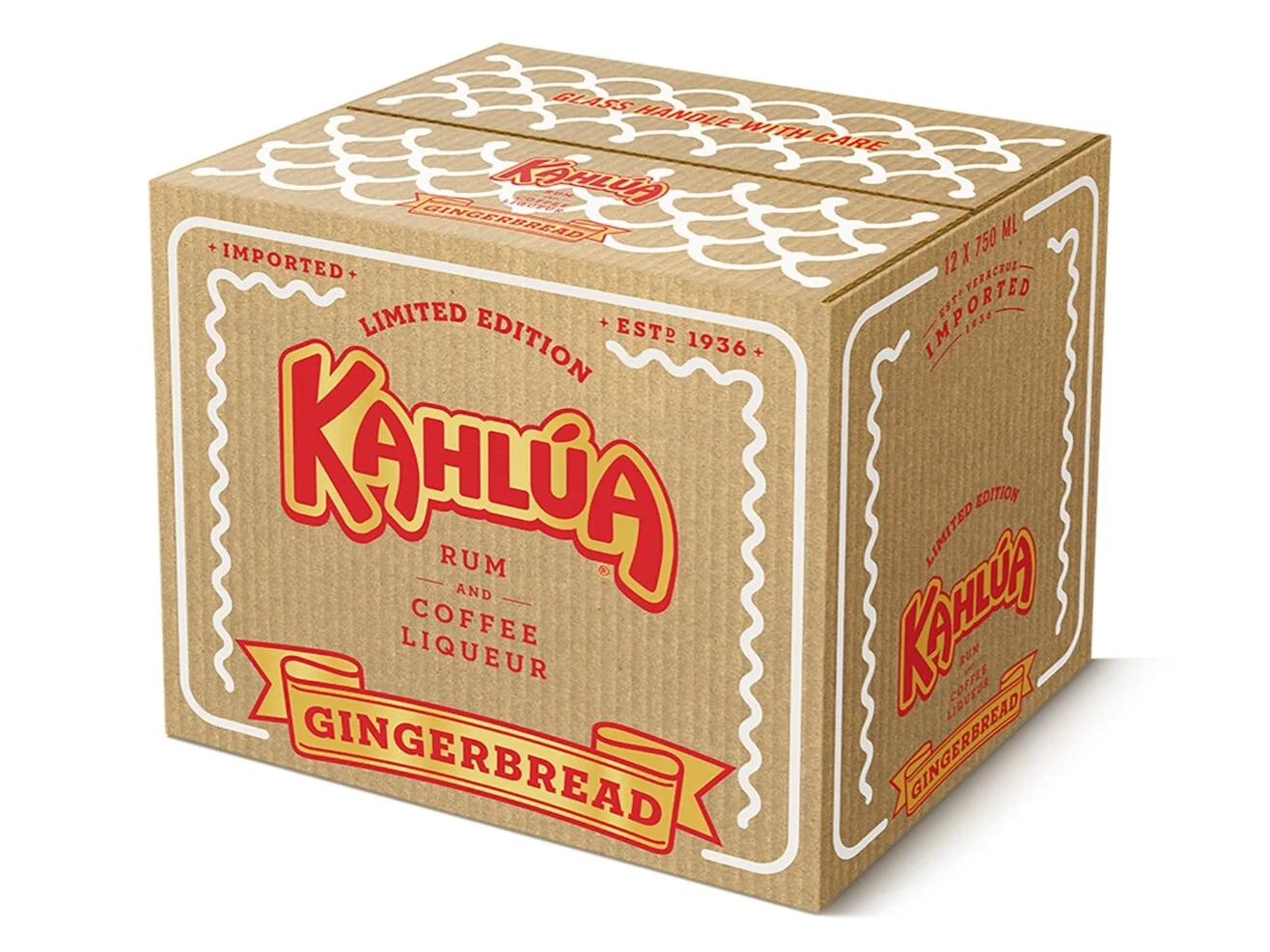
KAHLUA
BRAND REFRESH
See more of the logo evolution, packaging, product and portfolio expansion and innovation, and brand video
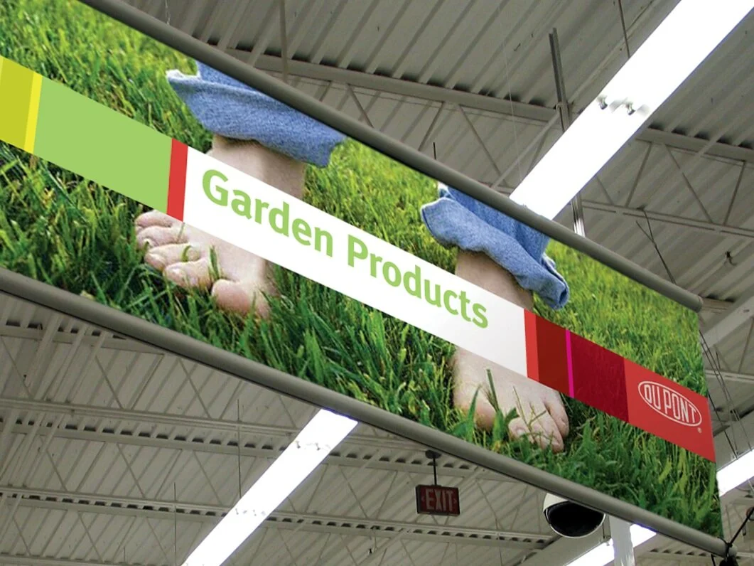
DUPONT
BRAND REFRESH AND RETAIL PROGRAM
Ten years of agency creative brand lead for retail systems, advertising and marketing campaigns, and private label
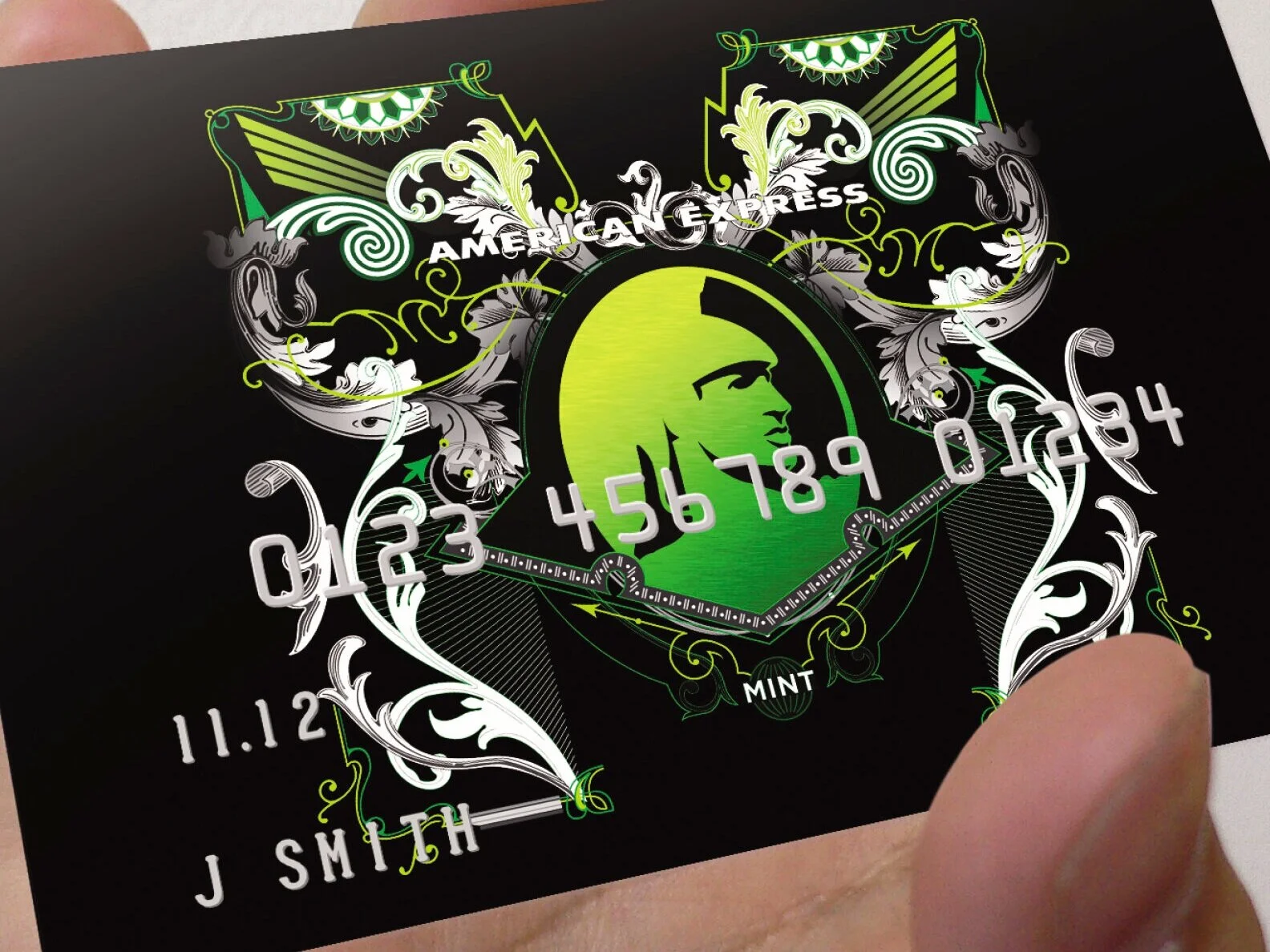
AMERICAN EXPRESS MINT
PRODUCT BRAND IDENTITY
Positioning, name, and brand identity work including advertising guidance and leadership
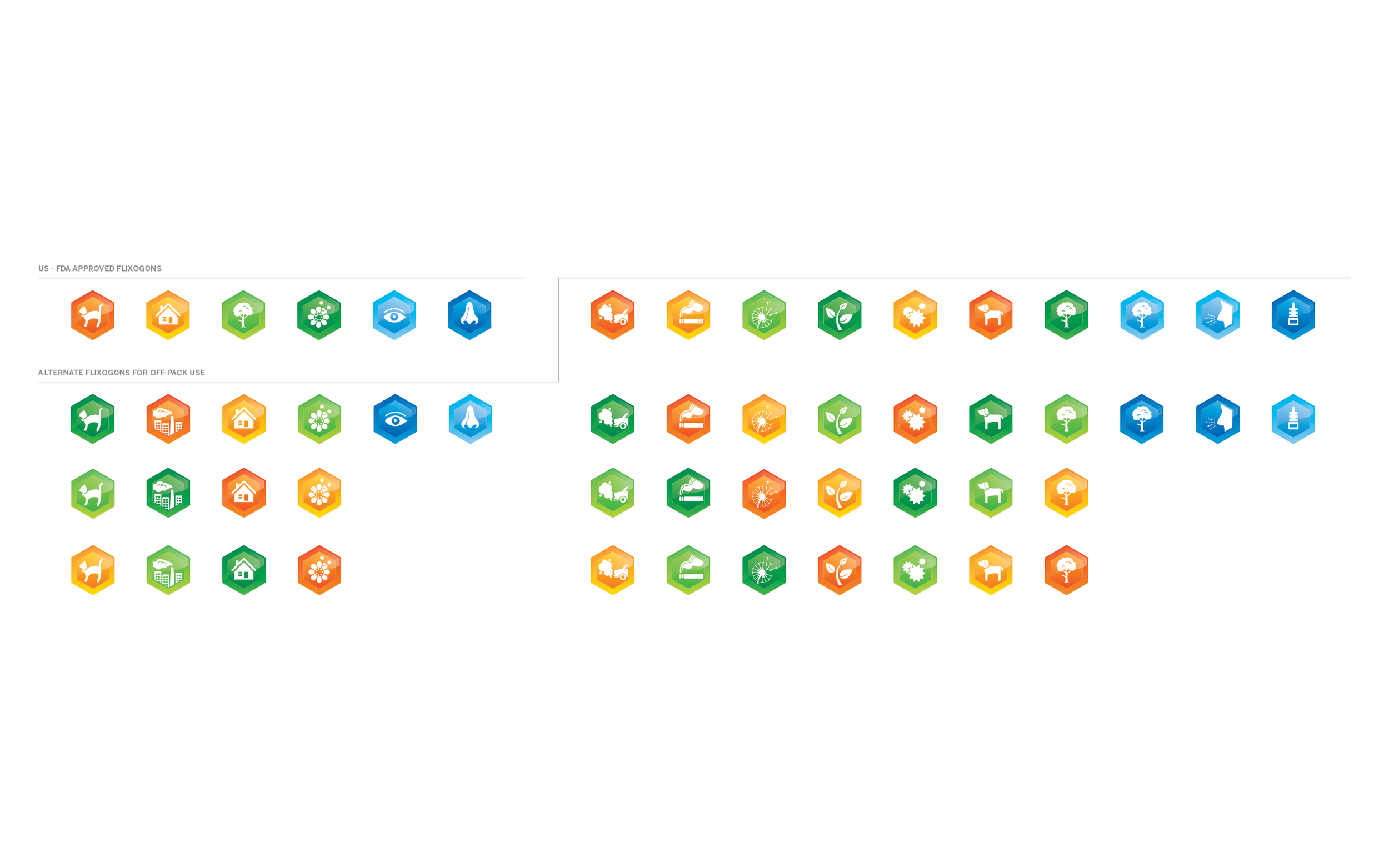
With Flonase, I led multi-disciplinary, international teams, partner agencies, and consumer testing as the brand steward and creative lead driving the launch for GSK and it’s largest, most successful Rx to OTC conversion.
New positioning, brand identity, and packaging were at the forefront of the project. Delving into an emerging market of allergy medication, we would often ask ourselves, how do we redefine and own the allergy category much like the suntan lotion industry shifted to sunscreen and protection? Empathy, presence, efficacy, are all foundational starting points to build a strong, attention-getting brand presence.


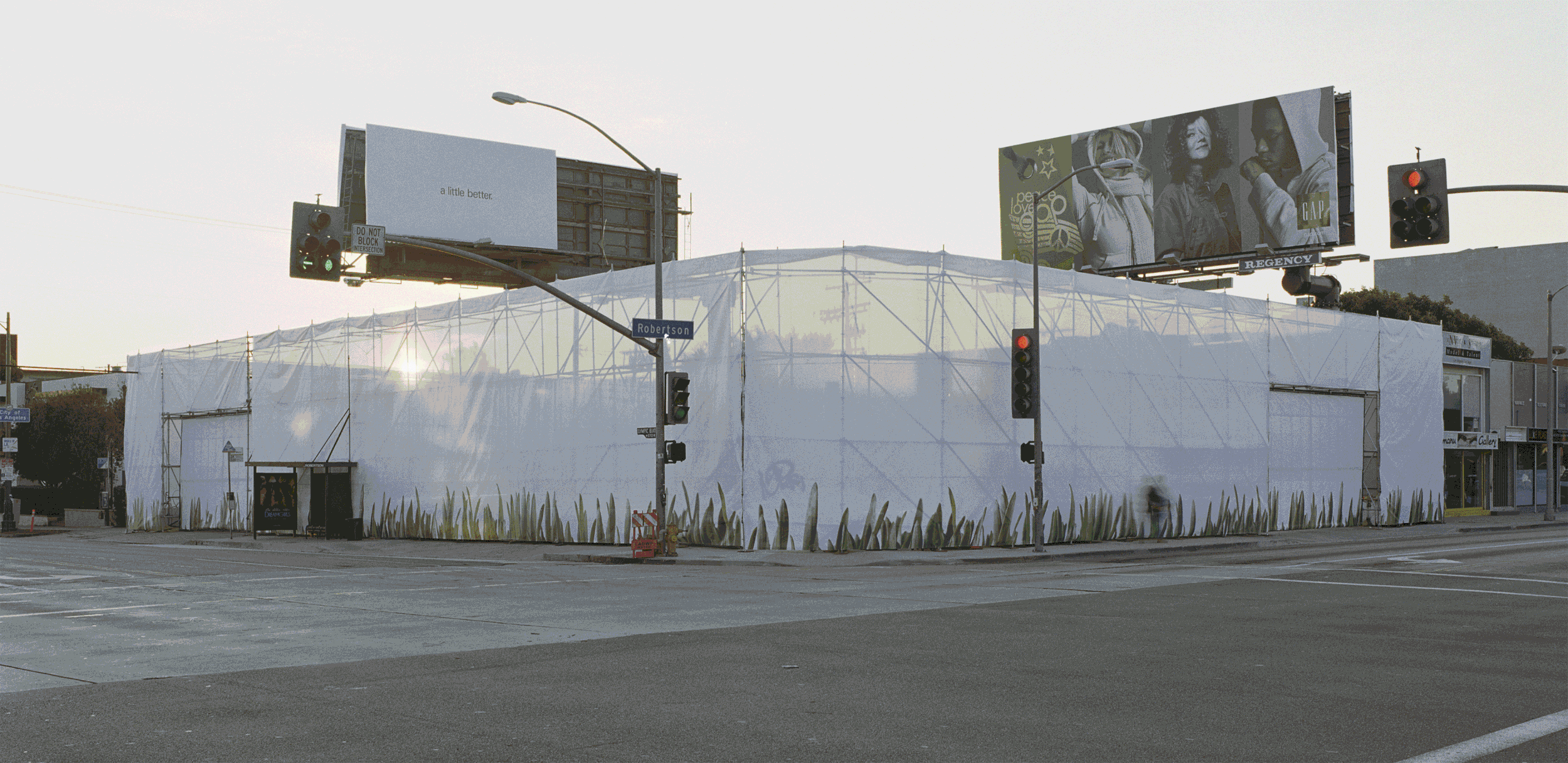
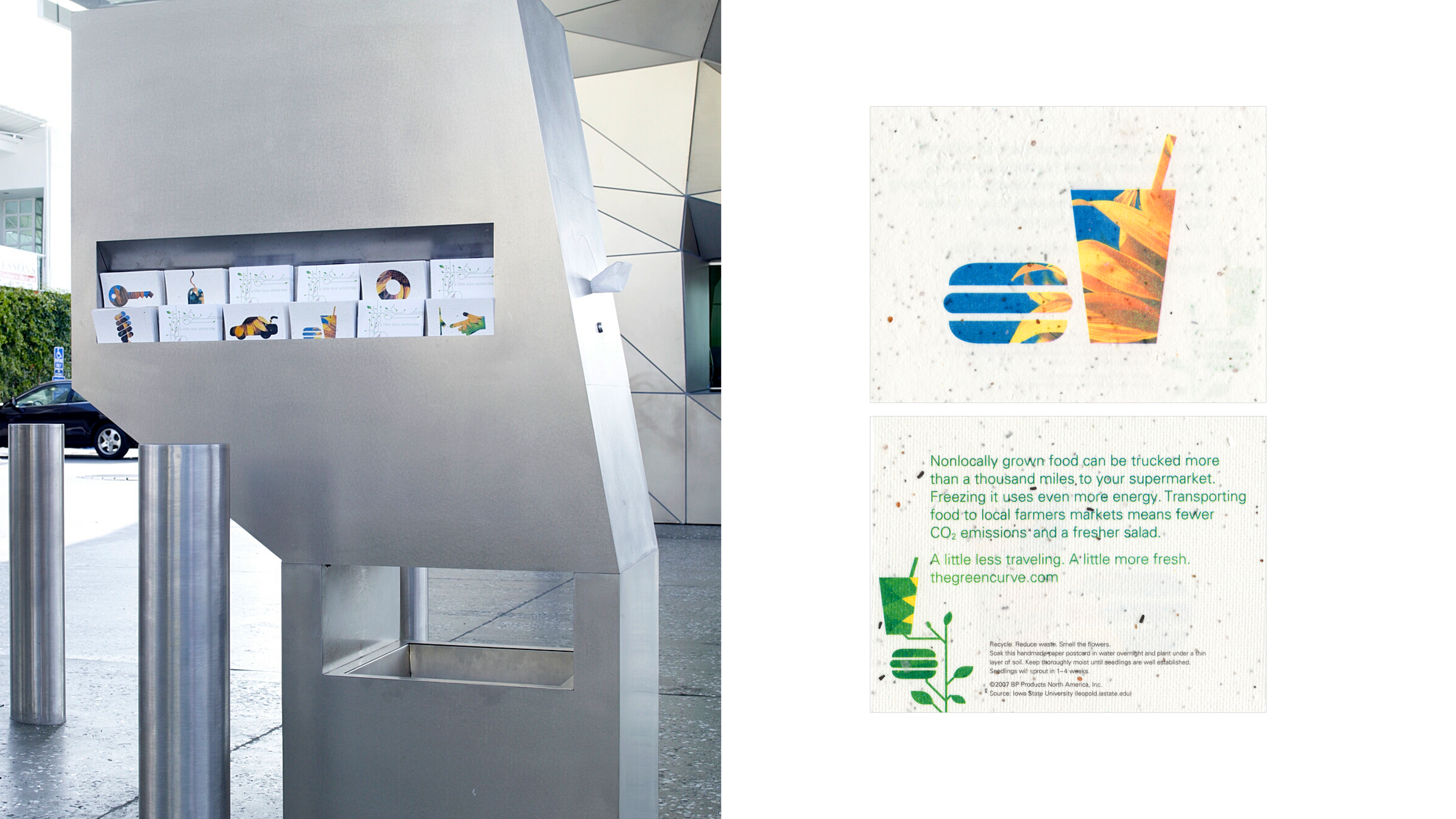
Blurring the lines between necessity, education, and entertainment, I led the vision and execution for a different kind of gas station experience that encourages interaction and everyday sustainability practices.
Given the unspoken desire of my client to have the W Hotel of gas stations, we integrated sustainable tips through pithy videos at the pumps (no advertising), gallery-like signage that called out the energy-saving initiatives, and a “green team” that would check your tire pressure and talk to guests about how they could do “a little better.” And, some animated light shows and custom, programmable music for a better visit to the bathrooms.
Consumer behavior shifted and extended what would normally be an unhappy 2–3 minute visit into an engaging 15–20 minute walk through the space asking questions and learning about how they can implement some practices into their daily lives.


And, there’s always a way to find something fun, innovative, and playful as part of our everyday lives and in our work, approach, and outlook on life.
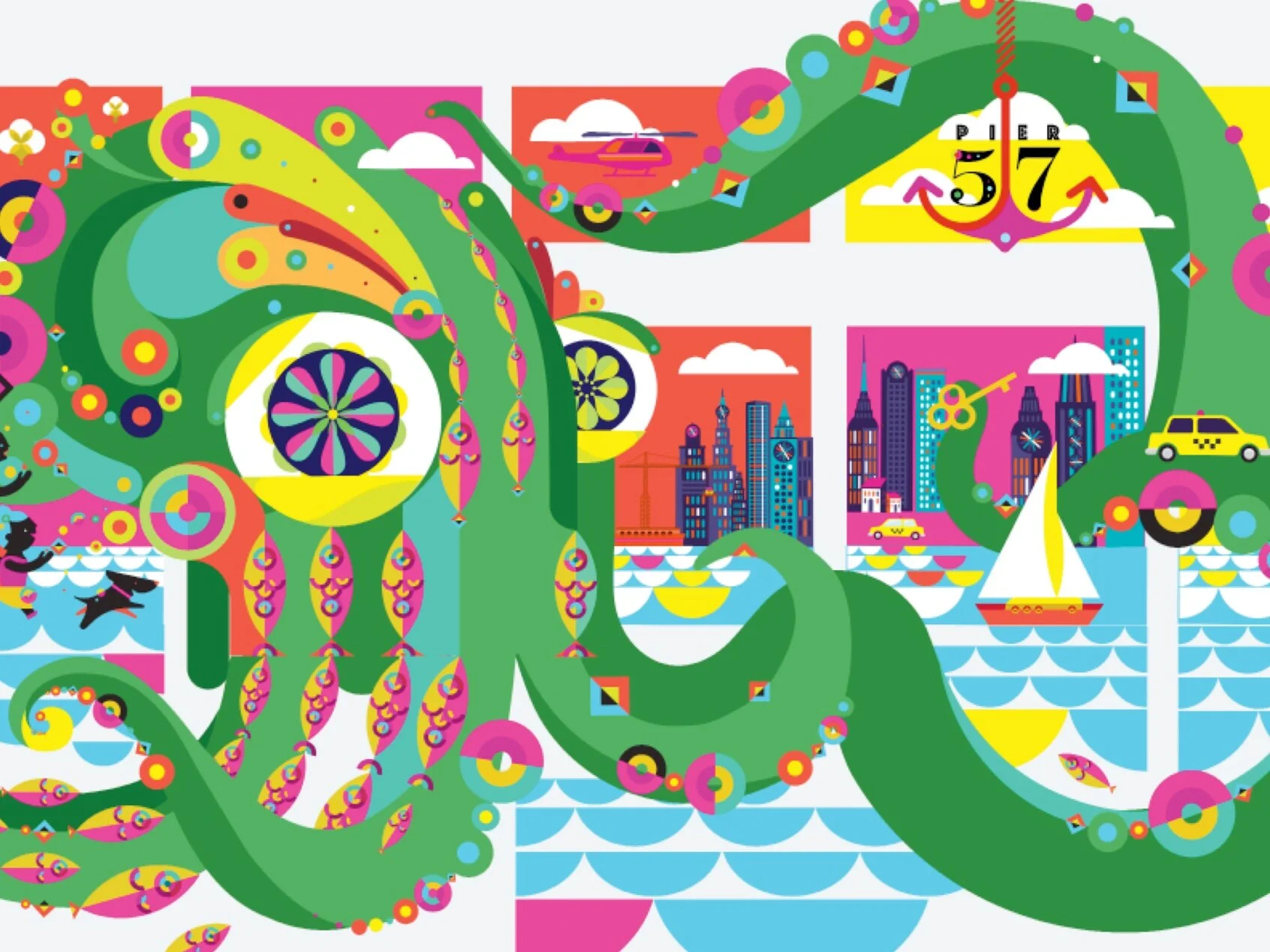
RXR — PIER 57
SPACE ACTIVATION
See how a mythical creature from the deep took over an architectural marvel
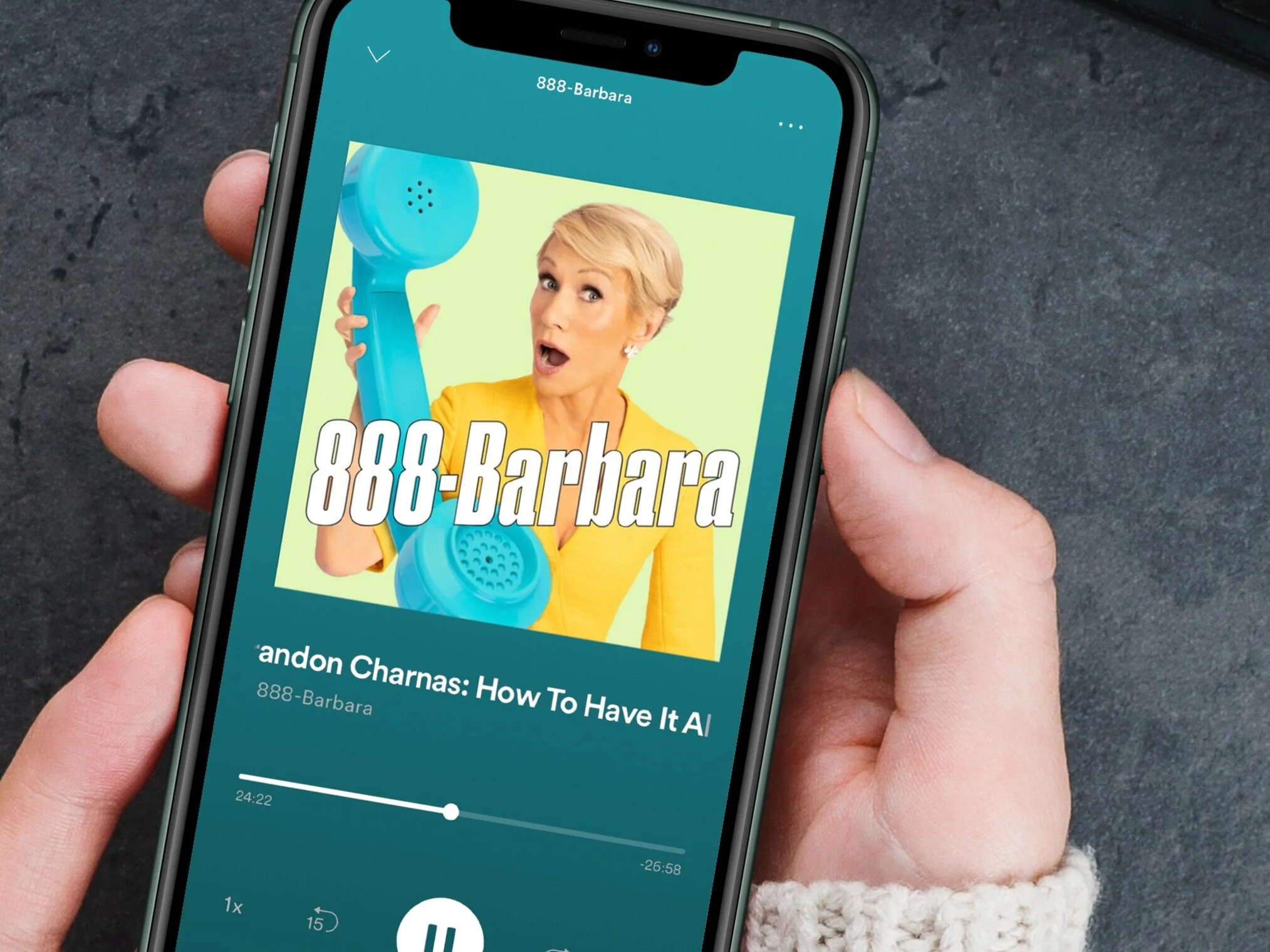
BARBARA CORCORAN
888-BARBARA VISUAL IDENTITY AND SOCIAL / ADVERTISING
See the full case study here

RXR — STARRETT LEHIGH
BRAND REFRESH
See more here and the digital advertising work we delivered produced the highest click rate both our client and their media company
At the core of my approach and experience, I sit at the center of the brand, providing vision, guidance, and best practices to nurture, innovate, and continue to bring life to the CAMP brand and its people, customers, and partners.
I look forward to speaking further to discover how we can work together!